Grid: Increasing On-Campus Travel Accessibility
May - July 2021 (10 weeks)
iOS Mobile App Accessibility Design
-
I oversaw early development and brainstorming. Also collaborated with my team of four as one of the Lead UX Designers and Researchers throughout the project cycle from design strategy, to wire-framing and content development.
-
Accessibility Design, Brainstorming,Content Strategy, FigJam, Figma, Google Drive, Human-Centered Decision, Information Architecture, Miro, Prototyping, Research, UI/UX Design, Usability Testing, User Personas, Wireframing
Overview
In my Design Methods class, our team was tasked with choosing a United Nations’ Sustainable Development Goal and crafting a project around it. Choosing Goal 11, Sustainable Cities and Communities, we developed Grid over the academic quarter.
Grid, an iOS smartphone application and social platform, helps students with mobility disabilities navigate the University of Washington Seattle (UW) campus. Grid maps community-sourced routes for students, including up-to-date information about traffic, construction, and other obstacles. Our app reimagines accessibility technology by centering efficient design and community in order to make accessibility discourse an intentional discussion around campus.
The Challenge
To begin this process, our team brainstormed many ideas of communities we wanted to serve, ultimately deciding on UW students with mobility disabilities (a historically disenfranchised group on our campus—made even more relevant by the ongoing COVID-19 pandemic).
Looking at the UW Disability Resources for Students (DRS) ecosystem, we honed in on current mobility accessibility resources students could easily attain at UW.
Collectively, we identified an enormous gap between digitization and information accessibility—an issue of sizeable importance given the 2,400+ students DRS serves. Put simply, offerings on the site tended to struggle with three main issues:
1) Information was hard to understand
2) Information was difficult to parse
3) Information was outdated + undetailed
With these issues in mind, our next step was figuring out how to best digitize this information and make it more accessible. Understanding that a mobile interface would be relevant to our college-age stakeholders and crucial to bridging a gap between digitization and information, we delved into exploratory research to further identify the pros and cons of the competitive landscape. Quickly uncovering a fairly sparse landscape, we compared existing Solution A and Solution B—two interactive mobile map applications that allowed wheelchair users to see what spaces were easily navigable via information provided by users. I identified their most attractive and unattractive features as determined by user feedback:
Competitive Analysis
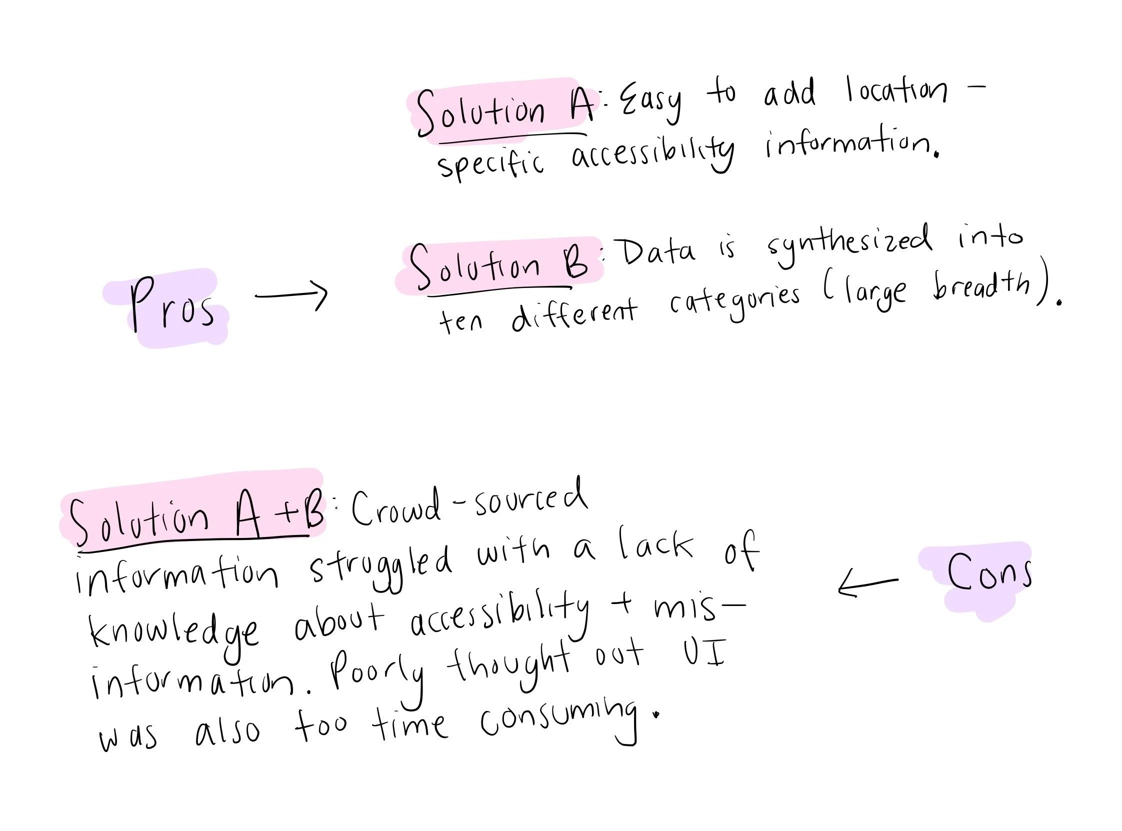
Overwhelmingly, these solutions, while valuable on paper, were insufficient and showed a clear misunderstanding of accessibility—often requiring mobility-impaired users to stop, use the app, and then go about their day. With this in mind, our team conducted preliminary interviews with UW community members to better explore the problem within a smaller scope.
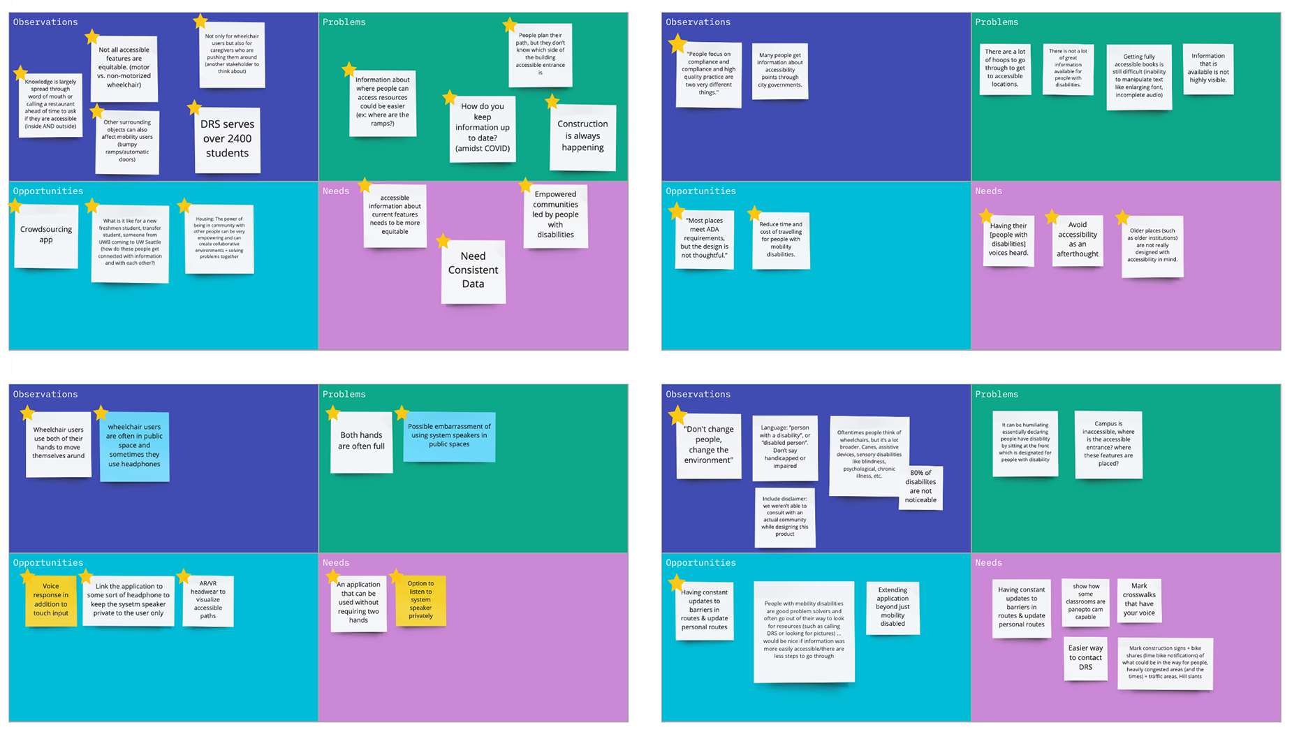
Exploratory Interviews
Conducting four user interviews, participants ranged from students to disability studies professors, to family members of people with disabilities. With this user research, our team was able to synthesize our notes into Observations, Problems, Opportunities, and Needs.
Further condensing these findings, we created four main solution principles to serve as our North Star as we progressed through the design process.
Our solution will…
1) provide comprehensive support for UW students with mobility disabilities.
2) address the lack of campus awareness about accessible navigation actively marginalizing people with mobility disabilities.
3) enable UW students with mobility disabilities to easily + efficiently navigate to their desired destination on campus.
4) be open access to all community members.
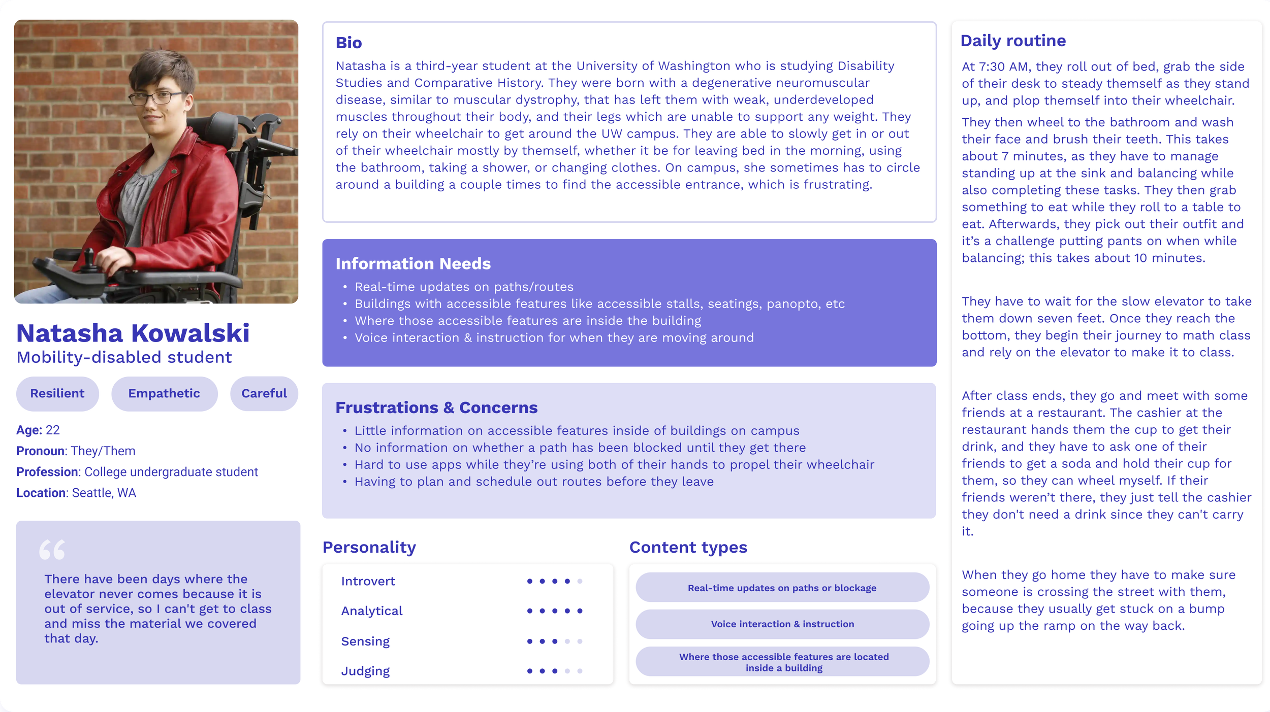
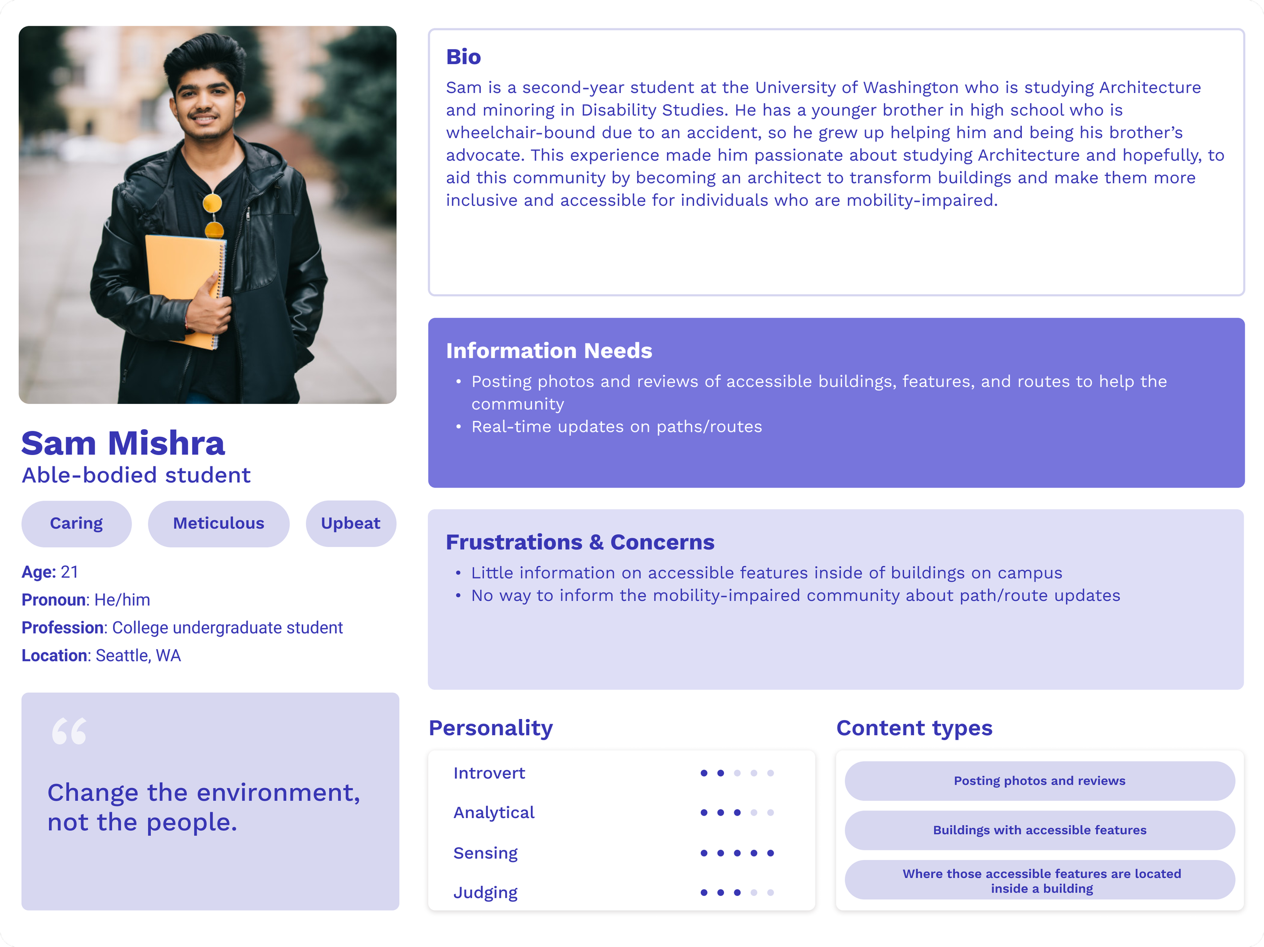
User Personas
Following our research, I aided in crafting personas to better understand how our users would interact with Grid. These personas were created through a combination of the individuals we interviewed and those we intended to reach with this project. Our main user persona centered around a mobility-disabled student who would regularly use the app, while our second persona recognized that some students might be drawn to contribute to the app because of their connection to the disability community.
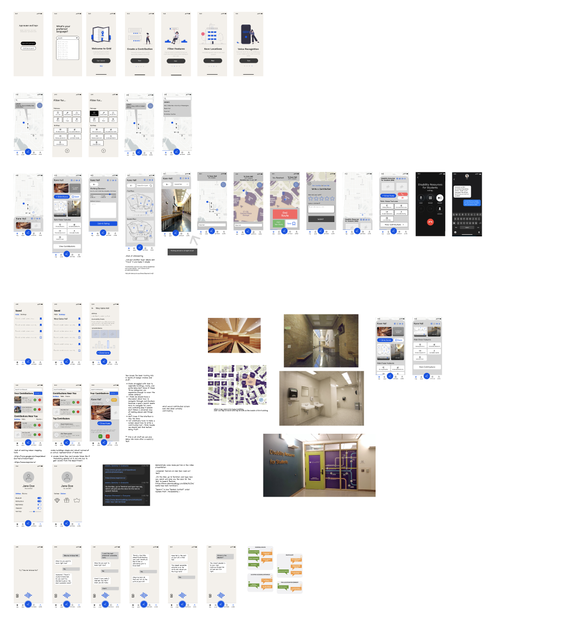
Low-Fidelity Prototype
Using what we gathered from our research and personas, our team created low-fidelity prototypes to utilize in our usability testing phase. I aided in developing the overall information architecture of the app, the Contributions page, and the Profile page.
Generating the low-fidelity prototype, we took the concerns voiced by our focused community and input them into a simple interface that reflected the main interactions of the app. Each button on the bottom dashboard of our app was given a row, in which pages were developed to communicate the general architecture of Grid as a map and social app.
Usability Testing
Next, we completed three usability tests to gain feedback. In each test, we asked the user to complete seven tasks. During the tasks, we observed them, asked them to rate the task’s difficulty from 1-5 and provide additional comments. Here were our main takeaways from testing:
Usability Test 1
Our app lacks discoverability thus more standard icons, labels, and buttons are needed to streamline the user experience.
Usability Test 2
Certain design and grammatical choices convey a lack of professionalism and take away from the branding of Grid.
Usability Test 3
Information architecture is very unclear and feedback is inadequate. Content seems scattered around the app instead of interconnected and circular.
High-Fidelity Prototype
Going into the final stages of development, our exploratory research and insights from usability testing shaped what these mock-ups looked like. This culminated into our high-fidelity prototype that we presented at the end of the quarter.
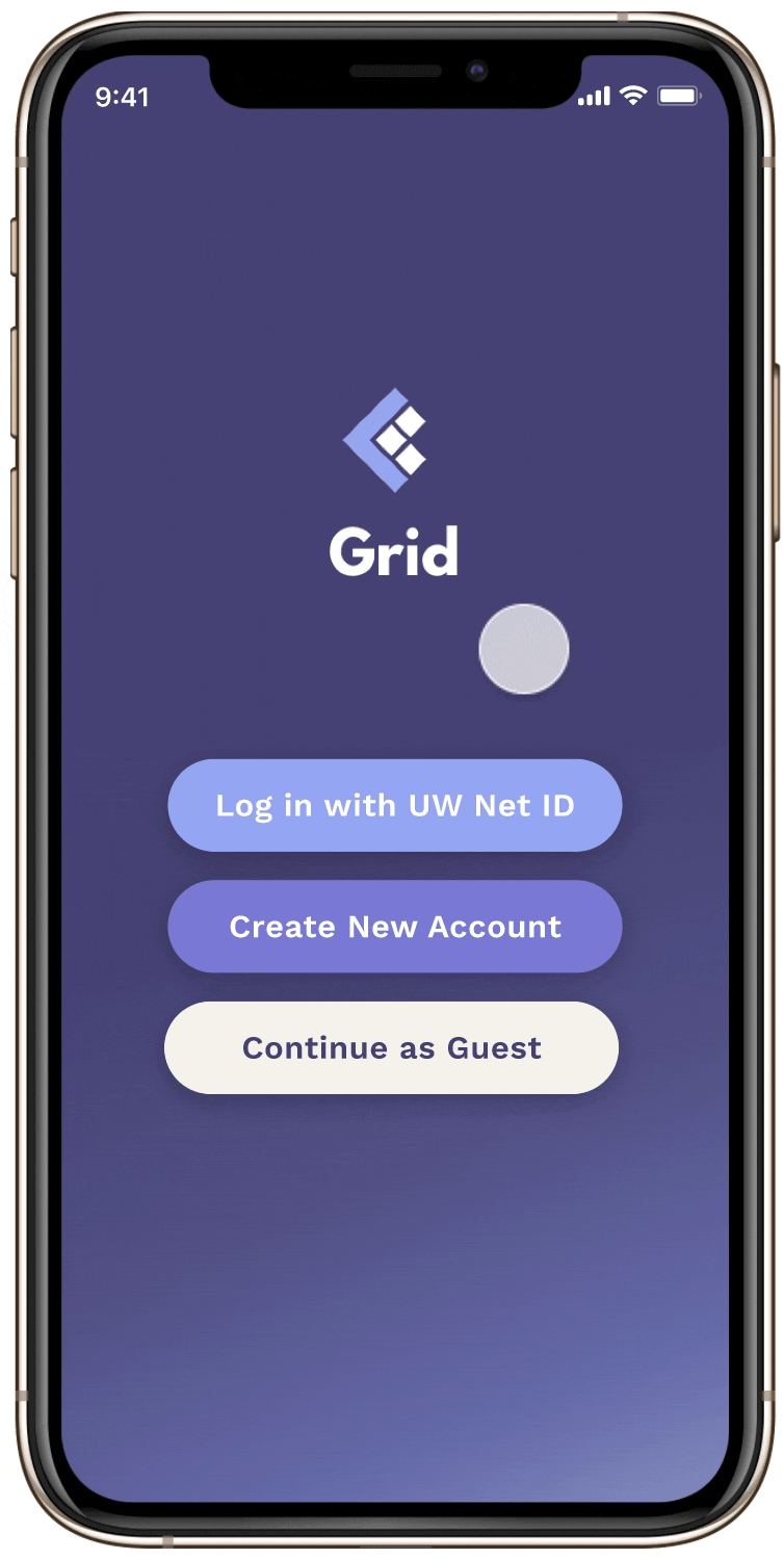
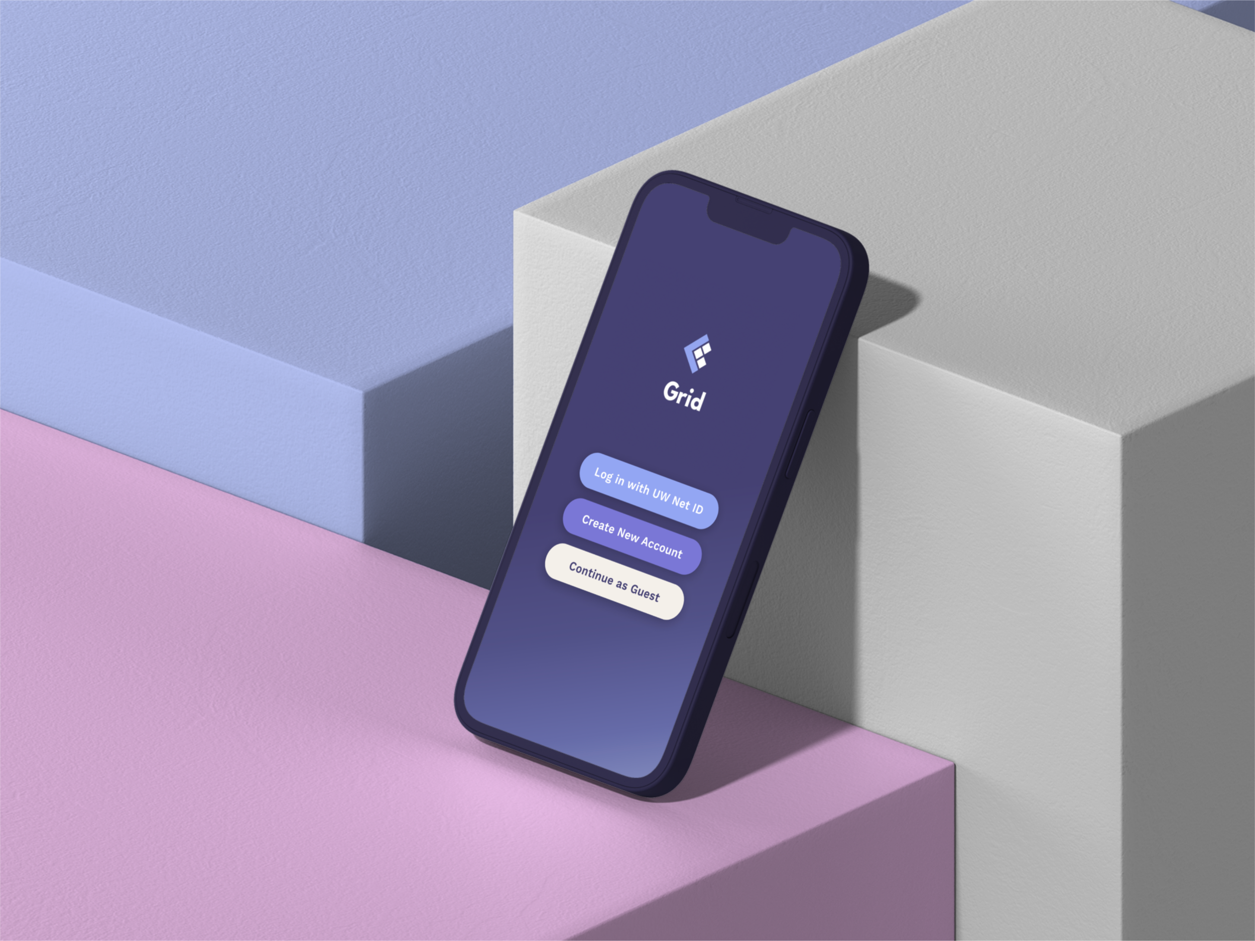
Introductory Pages
→ Log in with a UW Net ID, create a new account, or continue as a guest. This was integrated after exploratory research and usability tests showed us the app has relevance for users who are not affiliated with UW, such as a prospective student.
→ Users are given a welcome to the app and a tutorial of how to use various features.
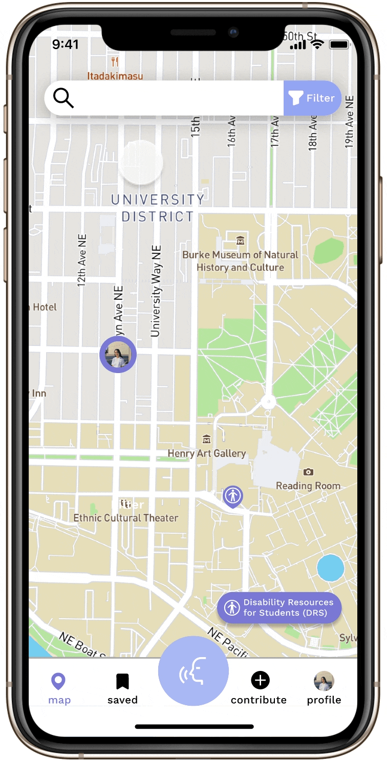
Map Tab
→ Tap on the Disability Resources for Students (DRS) icon to easily contact the organization.
→ Search and map to a destination. Filters can be added for obstacles that might block a user’s pathways or buildings.
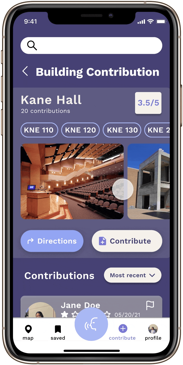
→ Search or click on buildings to get more information about accessibility details, the address, and top Contributions.
→ Buttons were kept to a minimum to limit the number of taps. A higher contrast map and easily understandable icons were also added to improve UI.
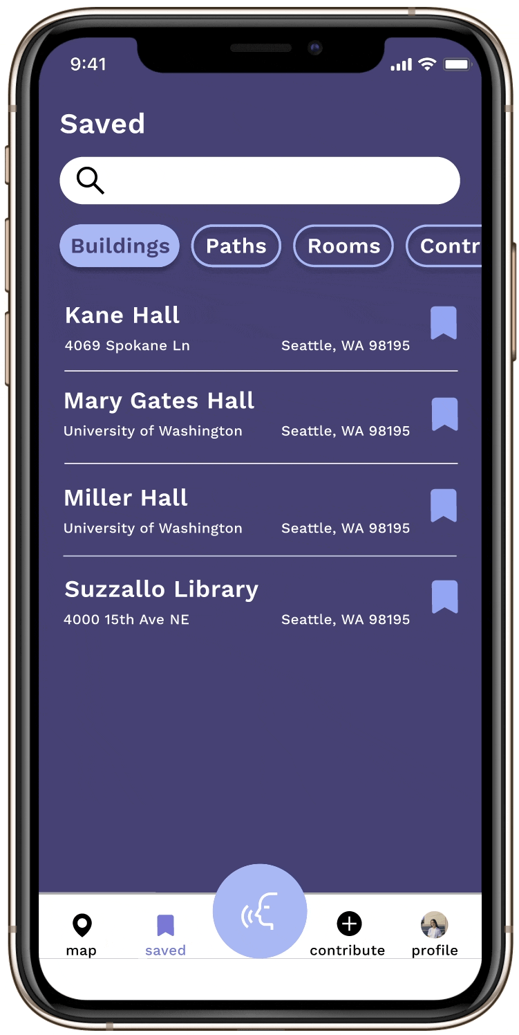
Saved Tab
→ Users can search or switch between buildings, paths, rooms, and Contributions that they visit often.
→ A path or location can be saved by clicking the bookmark icon. This can be done in the Map or Contribute tab
→ Each listing in the tab has directions, the address, accessibility details, uploaded media, Contributions, and average traffic. This page was created to limit active time spent on the app. Users can quickly find the location they want to navigate to.
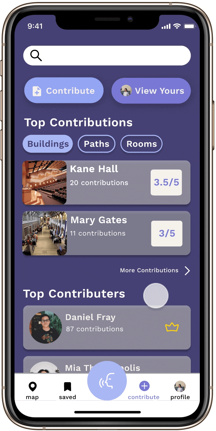
Contribution Tab
→ Users can look for Contributions. Contributions are user-written accessibility insights about buildings, rooms, or paths around UW. These Contributions are like accessibility reviews written by the UW population.
→ Buildings, paths, and rooms are given an accessibility rating calculated through the averaged rating they receive from users.
→ Clicking on a building, room, or path, users are shown the accessibility rating, related spaces, and Contributions
→ Users can upvote a Contribution, save it to their Saved tab, flag the review, or expand the review and view additional information about features such as elevators, bathrooms, doors, etc.
Making a Contribution
→ Click on the Contribute button. Users will be prompted to rate how accessible their building/room/path is. Next, they’ll add photos, leave comments, and/or rate accessible features with additional photos or comments. By clicking Submit users will then receive a sticker that will appear on their profile page.
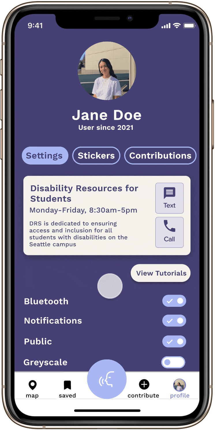
Profile Tab
→ Users can contact the DRS, rewatch tutorials, change their settings to their specific needs and preferences, see their stickers (which they receive by making Contributions), and view their Contributions.
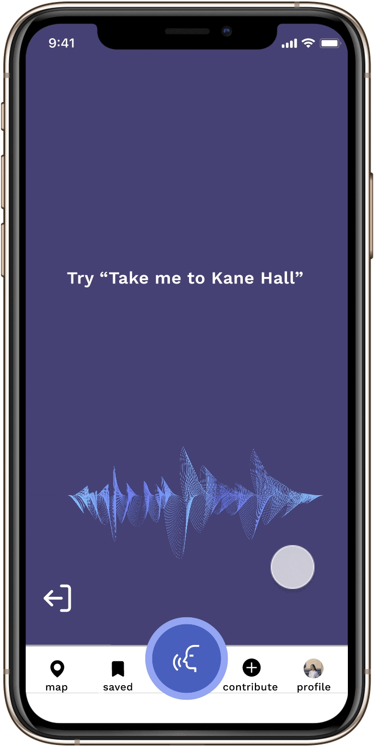
Voice Mode
→ The entire app can be interacted with using the voice UI. After tapping on the blue icon to activate the voice interface, users can speak commands, such as searching for a location, and hear responses. Users can tap the blue icon again to turn off the function and interact with the app using the touch UI. This hands-free interaction allows the user to continue using the app even if both of their hands are occupied.
Centering our app around navigating to destinations and Contributions, our hope is that crowd-sourced information and necessity will enable larger awareness about accessibility around UW for those with and without mobility disabilities. With some accessibility ratings ultimately being low and buildings/rooms/paths being in poor condition, Grid will show that accessibility must continuously be developed, spoken about, and updated. Moreover, with a guided process to create Contributions, our app, unlike competitors, will have a format that allows users to feel confident that their review is meaningful. Looking to the future, these Contributions and empathetic mapping feature will aid in creating a community around accessibility; one that exemplifies the fluidity and nuance needed to enter the conversation.
Limitations
In creating Grid, we hoped to foster a more tight-knit community as users share more common points of interest and can more easily connect. Having said this, we recognize that our particular scope is limiting as it does not help students who travel off-campus into the larger Seattle area.
Furthermore, while our app improves the visibility of information about blocked paths, many obstacles will likely remain unknown to users until it is too late and the user has to turn back to find another route. An example of such obstacles includes Lime Bikes that are often left in the few accessible routes available. Raising awareness about the consequences of such actions to both users and the general public would help minimize such obstacles. While our app intends to make information quicker to find, accessibility is a nuanced and changing experience all the time. Consequently, our app cannot reflect that to its full capacity but we can aim to make progress in accessibility design on the UW campus.
Lastly, our app mainly focuses on providing accessibility information for people with mobility disabilities. While we designed features such as voice mode that also accommodates people with other disabilities, such as visual, we recognize our app can continuously be more accessible.
Future Iterations
→ Folding engineers into the project to develop a working prototype. Sponsorship from UW or a nearby accessibility tech company could help make Grid an actual product.
→ Expanding the social aspect of Grid to create a lasting accessibility community on the Seattle campus.
→ Conducting some type of testing such as a diary study or A/B test after developing a working product to better understand what parts of the experience could be made more accessible. What tension points remain for the user?
→ Exploring error states and integrating them into the user flows.
→ More in-person work sessions. This entire project, from start to finish, was developed virtually during the height of the COVID-19 pandemic. With the chance to develop this further. I would love to meet my teammates and see how designing together can impact a project.
Reflection
Working on Grid I learned many lessons:
Collaboration is important. I wouldn't have been able to iterate so many times on a design without my peers telling me it could be better and providing actionable feedback. If we design proactively, in a group where everyone is supported, the work being done will always be of higher quality. When we check in with our team and hold everyone accountable, while being aware of their needs, we can care for our team and consequently care for our users. Having a strong team with good communication skills was crucial to a successful design.
Always design with context. Never design in isolation without understanding the larger context of what you are doing. Many times during the process my team and I got lost in ideating and forgot to recenter our goals towards our intended scope and North Star. It can be easy to get carried away when designing so always be intentional.
Moving forward, this project has ultimately taught me how designing and UI/UX can be elevated through teamwork and dedication. As someone who is in the very early stages of my career, it felt extremely rewarding to put a lot of effort into a project and see the fruits of our labor. Undergoing the design process was strenuous however the end product was something I was extremely proud of and my identity as a designer felt stronger.